1. Keep it Clear and Concise
Use Action-Oriented Language
Using action-oriented language is crucial when creating effective call-to-actions on your landing pages. Your CTA should clearly communicate what action you want your visitors to take, and using strong verbs can help achieve this. Instead of using passive language like “submit” or “enter,” try using more active language like “get started,” “download now,” or “join us.” This not only makes your CTA more compelling but also creates a sense of urgency and encourages visitors to take action immediately. Additionally, using action-oriented language can help your CTA stand out and grab the attention of your visitors, ultimately leading to higher conversion rates.
Make it Easy to Understand
When creating a call-to-action on your landing page, it’s important to make it easy to understand. This means using clear and concise language that clearly communicates what action you want the user to take. Avoid using industry jargon or complex terminology that may confuse or intimidate your audience. Instead, use simple and straightforward language that is easy to read and understand. Additionally, make sure your call-to-action stands out visually on the page, using contrasting colors or bold fonts to draw attention to it. By making your call-to-action easy to understand, you’ll increase the likelihood that users will take the desired action and ultimately convert into customers.
Avoid Jargon and Buzzwords
When creating call-to-actions on your landing pages, it’s important to avoid using jargon and buzzwords. These terms may be familiar to you and your industry, but they can be confusing and off-putting to your audience. Instead, use clear and concise language that clearly communicates the value of your offer and what action you want your visitors to take. Remember, the goal is to make it as easy as possible for your audience to understand and engage with your call-to-action. By avoiding jargon and buzzwords, you can create a more effective and user-friendly landing page that drives conversions and achieves your marketing goals.
2. Make it Stand Out
Use Contrasting Colors
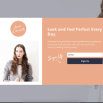
Using contrasting colors is a great way to make your call-to-action stand out on your landing page. By choosing colors that are opposite on the color wheel, you can create a visual contrast that draws the eye to your CTA button. However, it’s important to use contrasting colors in a way that is still visually appealing and consistent with your brand. Consider using your brand colors as a starting point and then selecting a contrasting color that complements them. Additionally, make sure that your CTA button is large enough and placed in a prominent location on your landing page to maximize its impact.
Larger Font Size
Larger Font Size is an essential aspect of creating an effective call-to-action on your landing page. It is crucial to make your CTA stand out and grab the attention of your visitors. A larger font size can help achieve this goal. However, it is important to strike a balance between the size of the font and the overall design of your landing page. A font that is too large can be overwhelming and may not fit in with the rest of your page’s design. Therefore, it is recommended to experiment with different font sizes and find the perfect balance that works for your landing page.
Place it Above the Fold
Placing your call-to-action above the fold is crucial for grabbing the attention of your visitors. The fold refers to the area of your landing page that is visible without having to scroll down. By placing your call-to-action above the fold, you ensure that it is the first thing your visitors see when they land on your page. This increases the chances of them taking action and clicking on your CTA. Make sure your CTA stands out by using contrasting colors, bold fonts, and clear language. Remember, the goal is to make it as easy as possible for your visitors to take action.
3. Use Urgency and Scarcity
Create a Sense of Urgency
Creating a sense of urgency is a powerful way to encourage visitors to take action on your landing page. By using phrases like “limited time offer” or “act now,” you can create a sense of scarcity that motivates people to act quickly. You can also use countdown timers or other visual cues to reinforce the urgency of your offer. However, it’s important to strike a balance between urgency and pushiness. If you come across as too aggressive or manipulative, you may turn people off and damage your brand’s reputation. Instead, focus on creating a genuine sense of urgency that aligns with your value proposition and resonates with your target audience.
Highlight Limited Availability
Highlighting limited availability is a great way to create a sense of urgency and encourage visitors to take action quickly. You can use phrases like “limited time offer” or “only X left in stock” to create a sense of scarcity. This can be especially effective for products or services that are in high demand or have a limited supply. However, it’s important to be honest about the availability of your product or service and not create false scarcity. If visitors feel like they’ve been misled, it can damage your credibility and hurt your conversion rates in the long run.
Use Time-Sensitive Language
Using time-sensitive language in your call-to-action (CTA) can create a sense of urgency and encourage visitors to take action immediately. Phrases such as “limited time offer,” “act now,” or “don’t miss out” can be effective in motivating visitors to click on your CTA button. However, it’s important to ensure that the time-sensitive language is truthful and accurate. False urgency can damage your credibility and harm your conversion rates in the long run. Additionally, consider using time-sensitive language in conjunction with other persuasive techniques, such as social proof or scarcity, to maximize the impact of your CTA.
4. Offer Value
Provide a Clear Benefit
When creating a call-to-action on your landing page, it’s important to provide a clear benefit to your audience. This means that you need to clearly communicate what your audience will gain by clicking on your call-to-action. Whether it’s a free trial, a discount, or access to exclusive content, make sure that the benefit is front and center. By doing so, you’ll not only increase the likelihood of your audience clicking on your call-to-action, but you’ll also build trust and credibility with your audience by demonstrating that you understand their needs and are willing to provide value.
Use Specific Numbers and Statistics
Using specific numbers and statistics in your call-to-actions can greatly increase their effectiveness. For example, instead of using a generic phrase like “Sign up now,” try using “Join the 10,000 satisfied customers who have already signed up.” This not only adds credibility to your offer but also creates a sense of urgency and exclusivity. Additionally, using statistics to highlight the benefits of your product or service can be very persuasive. For instance, “Our product has been shown to increase sales by 50%,” is much more compelling than simply stating that your product can improve sales. By incorporating specific numbers and statistics into your call-to-actions, you can make them more persuasive and increase the likelihood of conversion.
Highlight Unique Selling Points
Highlighting unique selling points is crucial for creating effective call-to-actions on your landing pages. Your unique selling points are what sets you apart from your competitors and makes your product or service stand out. By highlighting these points, you can convince your potential customers that your offering is the best choice for them. Make sure to focus on the benefits that your product or service provides and how it can solve their problems or meet their needs. Use clear and concise language to communicate your unique selling points and make them easy to understand. By doing so, you can increase the chances of your call-to-action being clicked and ultimately, convert more visitors into customers.
5. Keep it Simple
Avoid Overwhelming Visitors
When it comes to creating effective call-to-actions on your landing pages, it’s important to strike a balance between providing enough information and overwhelming your visitors. Too many options or too much text can lead to confusion and a lack of action. To avoid overwhelming your visitors, keep your call-to-actions clear, concise, and focused on one specific action. Use simple language and avoid jargon or technical terms that may be unfamiliar to your audience. Additionally, limit the number of options and only include the most important information to help guide your visitors towards taking the desired action.
Use Minimal Design
When it comes to designing your call-to-action (CTA), less is often more. Using a minimal design can help draw attention to your CTA and make it stand out on the page. Avoid cluttering your landing page with too many elements or distracting graphics that could take away from the main focus of your CTA. Instead, opt for a clean and simple design that highlights the benefits of clicking on your CTA. This can help increase the chances of your visitors taking action and ultimately converting into customers. Remember, the goal of your landing page is to guide your visitors towards your CTA, so make sure it’s easy to find and visually appealing.
Limit the Number of CTAs
Limiting the number of CTAs on your landing page is crucial for ensuring that your visitors don’t get overwhelmed or confused. Too many CTAs can lead to decision paralysis, where visitors are unable to choose which action to take. It’s best to focus on one or two primary CTAs that align with your overall marketing goals. This will help to keep your messaging clear and concise, and make it easier for visitors to take the desired action. Additionally, limiting the number of CTAs can also help to reduce clutter on your landing page, making it more visually appealing and easier to navigate.
6. Test and Optimize
A/B Test Different CTAs
A/B testing is a crucial step in optimizing your call-to-actions on landing pages. By testing different variations of your CTAs, you can determine which ones are most effective in driving conversions. This involves creating two versions of your landing page, each with a different CTA, and then measuring the results to see which one performs better. You can test different elements of your CTAs, such as the wording, color, size, and placement. By continually testing and refining your CTAs, you can improve your conversion rates and ultimately achieve better results from your landing pages.
Track and Analyze Results
Once you have implemented your call-to-actions (CTAs), it is important to track and analyze their performance. This will help you understand which CTAs are resonating with your audience and which ones are not. You can use tools like Google Analytics to track the number of clicks, conversions, and bounce rates for each CTA. By analyzing this data, you can make informed decisions about which CTAs to keep, which ones to modify, and which ones to remove altogether. Remember, tracking and analyzing results is an ongoing process, so make sure to regularly review your data and adjust your CTAs accordingly.
Continuously Optimize for Better Performance
To ensure that your call-to-actions are performing at their best, it’s important to continuously optimize them. This means regularly testing different variations of your CTAs to see which ones are resonating best with your audience. You can experiment with different colors, wording, placement, and even the shape of your CTA buttons. By analyzing the data and making adjustments accordingly, you can improve your conversion rates and ultimately drive more leads and sales for your business. Remember, optimization is an ongoing process, so don’t be afraid to try new things and make changes as needed.
Now that you have learned the 10 best practices for creating effective call-to-actions on your landing pages, it’s time to put them into action. If you want to take your website to the next level, Nonstop Development can help. Our team of experts can assist you in creating a website that not only looks great but also converts visitors into customers. Visit our website at https://www.nonstopdev.com to learn more and schedule a consultation today. Don’t wait, take the next step towards a successful online presence.

Introduction: What is a Micro-SaaS Business? A Micro-SaaS business is a small software-as-a-service (SaaS) company that focuses on solving a Read more

Clear and Compelling Headline The Importance of a Strong Headline The headline of your landing page is the first thing Read more

What are landing pages? A landing page is a standalone web page that is specifically designed to convert visitors Read more

Dos for Landing Page Design Keep it Simple and Clean When it comes to designing a landing page for lead Read more